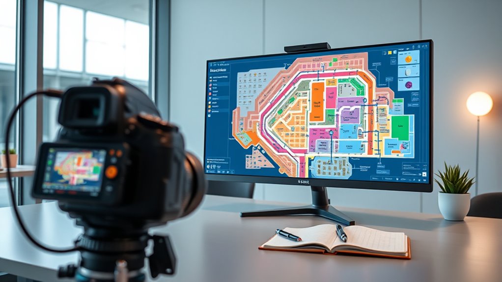
To create effective multi-floor maps, prioritize central elevator placement and strategic stair locations for easy navigation. Use clear signage, consistent colors, and distinct icons to guide users smoothly across levels. Design each floor with a clear visual hierarchy, highlighting key areas and pathways while minimizing clutter. Regularly test your maps with real users and refine details for improved usability. Keep these best practices in mind to craft maps that are both intuitive and safe—more tips follow to guarantee your success.
Key Takeaways
- Prioritize central elevator placement and strategically locate staircases to improve accessibility and flow across floors.
- Use clear layering with distinct color coding and prominent pathways to enhance visual hierarchy and reduce cognitive load.
- Maintain consistency in color schemes, labels, and symbols across all floors for a cohesive and professional appearance.
- Incorporate intuitive signage and icons for key features to facilitate quick navigation and wayfinding.
- Test maps with real users, gather feedback, and refine interactive elements to ensure clarity, accessibility, and optimal user experience.
Planning and Structuring Your Multi-Floor Maps

Before you begin creating your multi-floor maps, it’s vital to plan and structure them carefully. Start by considering elevator placement; placing elevators centrally improves accessibility and flow between floors. Think about staircase design too—ensure staircases are strategically located for quick access and safety. Properly planned elevator and staircase positions influence how smoothly users navigate your building. Keep pathways clear and logical, connecting key areas on each floor seamlessly. Avoid cluttering the map with unnecessary routes or awkwardly positioned stairs. Instead, aim for a layout that minimizes travel distance and maximizes efficiency. Well-thought-out planning at this stage creates a solid foundation, making your multi-floor maps intuitive and easy to follow for anyone using the space. Incorporate clear signage to further enhance navigation and user experience throughout your building.
Layering Floors Effectively for Clarity

Layering floors effectively is essential to creating clear and easily navigable multi-floor maps. To achieve this, establish a strong visual hierarchy by prioritizing the most important information on each level. Use color coding strategically to differentiate floors and highlight key areas, making it easier for users to orient themselves. Assign distinct colors to each floor or zone, ensuring they stand out without causing confusion. Keep the layering simple—avoid clutter and overlapping elements that can obscure details. Think about how users will scan the map; arrange layers so that critical pathways and landmarks are most prominent. By combining a clear visual hierarchy with thoughtful color coding, you make your map intuitive, reducing cognitive load and guiding users effortlessly across multiple floors. Incorporating organizational strategies can further enhance clarity and maintain an orderly presentation.
Maintaining Consistency Across All Levels

Once you’ve established clear and distinct layers for each floor, maintaining consistency across all levels becomes key to creating an intuitive map. Use uniform color schemes to represent similar features across floors, helping users easily identify elements without confusion. Consistent color coding ensures that, for example, restrooms or emergency exits look the same on every level. Additionally, keep annotation consistency; label locations and symbols in the same style and placement throughout the map. This approach reduces cognitive load and makes navigation smoother. Regularly review your maps to ensure visual and informational uniformity. Applying consistent color schemes and annotation styles fosters Volkswagen Tuning a cohesive, user-friendly multi-floor map that feels intuitive and professional.
Incorporating Key Details for Easy Navigation

Incorporating key details into your multi-floor map makes wayfinding much easier for users. Use color coding to differentiate areas, such as blue for restrooms or green for exits, so users can quickly identify essential locations. Establish consistent icon standards—like a wheelchair symbol for accessible entrances or a fork and knife for dining areas—to create intuitive cues across all levels. Clear labels and symbols help users understand the layout without confusion. Avoid overcrowding the map with excessive details; instead, focus on highlighting critical information that guides visitors efficiently. Combining effective color schemes with standardized icons ensures your map is user-friendly and accessible. Additionally, understanding contrast ratio is vital for ensuring that the map’s visual elements are distinguishable under various lighting conditions, enhancing overall usability. These details streamline orientation, making the experience smoother and less stressful for everyone navigating your multi-floor space.
Testing and Refining Your Maps for User Experience

After designing your map with clear labels, icons, and color coding, the next step is to test it with real users. This helps identify issues with navigation, such as confusing icons or hidden accessibility features. Focus on how well users interact with markers and whether they understand icons and labels. Use feedback to refine interactive markers for clarity and visibility. Also, guarantee accessibility features like text-to-speech or high-contrast modes are effective. Conduct usability tests across diverse groups to uncover overlooked challenges. Here’s a quick overview:
| Aspect to Test | Focus Area |
|---|---|
| Interactive Markers | Clarity, visibility, and ease of use |
| Accessibility Features | Effectiveness for all users |
| User Feedback | Identifying confusing elements |
| Navigation Flow | Smoothness and intuitiveness |
| Map Responsiveness | Performance across devices |
Implementing these testing strategies ensures your map adheres to accessibility standards and offers a seamless user experience.
Frequently Asked Questions
How Can I Optimize Multi-Floor Maps for Accessibility?
To optimize multi-floor maps for accessibility, focus on enhancing visual accessibility by using high-contrast colors and clear, large fonts. Incorporate navigation aids like arrows, icons, and labels that guide users effortlessly through different floors. Confirm that the maps are easy to interpret for everyone, including those with visual impairments. Regularly test and update your maps to maintain clarity and usability, making sure all users can navigate confidently across all levels.
What Software Tools Are Best for Creating Multi-Floor Maps?
Imagine unveiling a detailed, seamless multi-floor map that guides users effortlessly. You’ll want building software and design tools that make this possible. Top choices include AutoCAD, Revit, and SketchUp—powerful programs that help you craft precise, layered designs. These tools offer intuitive interfaces and robust features, ensuring your maps are accurate and engaging. With the right software, you’ll bring clarity and dimension to complex spaces, enthralling every user’s journey.
How Do I Handle Complex Building Layouts With Multiple Staircases?
When handling complex building layouts with multiple staircases, you should focus on clear staircase diagrams that show each staircase’s location and flow. Use distinct symbols or colors for different staircases to avoid confusion. Guarantee your floor transition points are accurately marked, highlighting how each staircase connects floors. This approach helps users easily navigate the map, understanding the building’s vertical movement and making the map more intuitive.
What Are Common Pitfalls in Multi-Floor Map Design?
When designing multi-floor maps, you might stumble into pitfalls that cloud the user experience like fog on a mirror. Overcomplicating layouts, neglecting visual clarity, or failing to clearly mark staircases and elevators can lead to confusion. Keep your maps simple, consistent, and well-labeled. Prioritize intuitive navigation, so users can effortlessly find their way across floors. Avoid clutter, and make certain each level’s details are distinct yet cohesive for a seamless experience.
How Can I Integrate Real-Time Updates Into Multi-Floor Maps?
To integrate real-time updates into your multi-floor maps, you should leverage dynamic data sources that provide live updates. Connect these sources via APIs or webhooks to your mapping platform, ensuring that changes like new obstacles or route adjustments are reflected instantly. Implement automatic refresh mechanisms and clear visual indicators for live data, so users see the most current information. This approach keeps your maps accurate and responsive to real-time changes.
Conclusion
Creating clear, effective multi-floor maps can boost navigation by up to 40%, making your space more user-friendly. Remember to plan carefully, layer floors thoughtfully, and keep consistency across all levels. Incorporate key details that help users easily find their way, and always test and refine your maps based on feedback. With these best practices, you’ll enhance the user experience and make sure your maps serve their purpose perfectly. Happy mapping!


